

We’ve all seen them, or maybe tilted our heads as we were walking by them in a movie theater… head-scratching movie posters that don’t quite hit the mark. Included below are twenty movie one-sheets that for one reason or another didn’t make the intended impression (although a couple are interesting for different reasons).
This article was researched using the impawards.com website and the book, Worst Movie Posters of All Time by Gregory J. Edwards and Robin Cross, Interestingly, I disagreed with the majority of their selections, but it was still a useful resource.
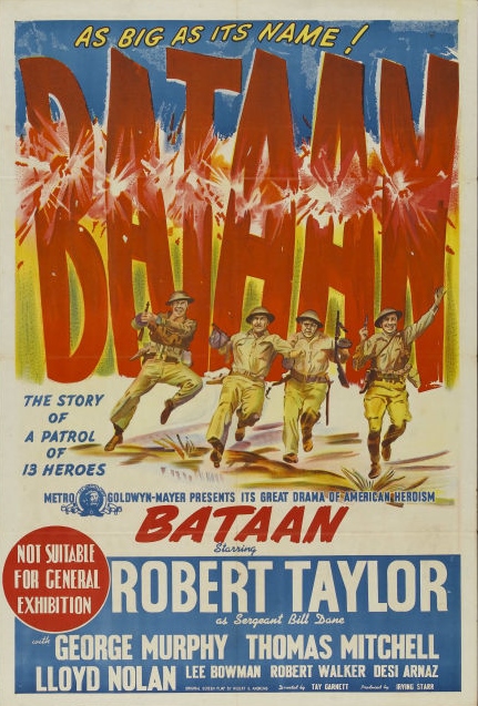 Bataan (1943) – Talk about misdirection in advertising. This is an award-winning war movie about a brutal campaign by US soldiers in the Philippines to prevent a bridge from being taken by enemy forces. But the poster features its grinning heroes leaping in the air and looking way too happy – in fact, it makes the picture look like some kind of bizarre war/dance flick! It’s a truly strange image and one can’t quite fathom why this was selected in order to sell the picture.
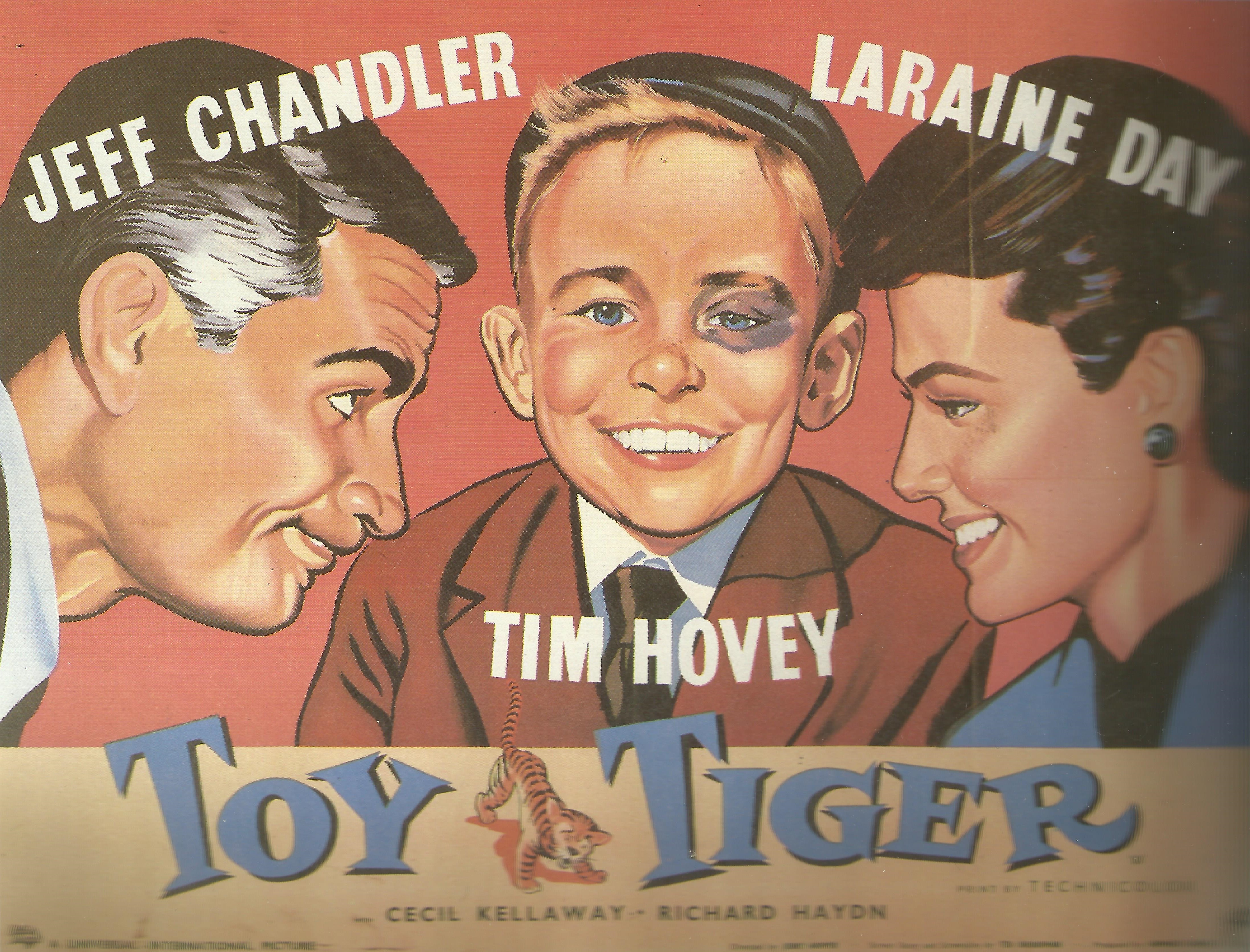 Toy Tiger (1956) – Umm, would you want to see this movie? I’m not sure if it’s just the smug look on that kid’s face (maybe that’s why he has the black eye), but there’s something inherently unlikable about this close-up image. In reality, it’s the tale of a bullied, fatherless kid who convinces an employee at his mom’s ad agency to pretend to be his dad. Reviews were actually okay for the feature… but that poster is simply irritating…
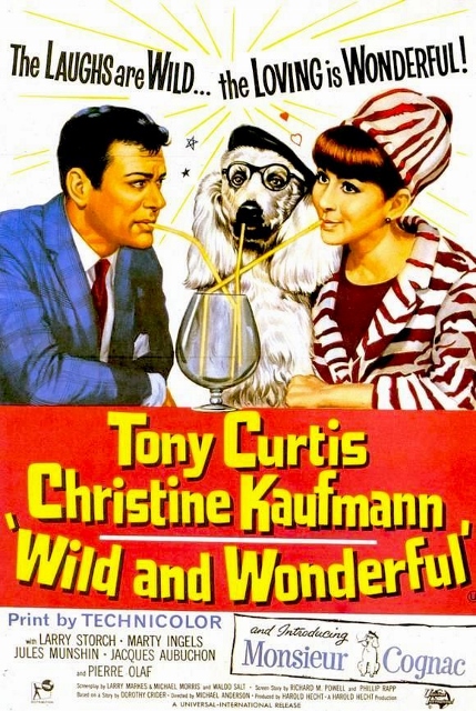 Wild and Wonderful (1964) – Actually, the art itself is fine in this one-sheet poster, but the movie it’s trying to sell… well… what exactly is going on here? It features three characters looking off in completely different directions. And that dog… what’s up with the glasses and beret? And if “…the loving is wonderful” who exactly is loving who? Reportedly, it’s about a spoiled poodle who tries to break up its owner’s marriage. Star Tony Curtis was under contract with the studio and had to appear in it – he hated the flick. It has never been released on home video, likely to spare us having to study that cover image even longer.
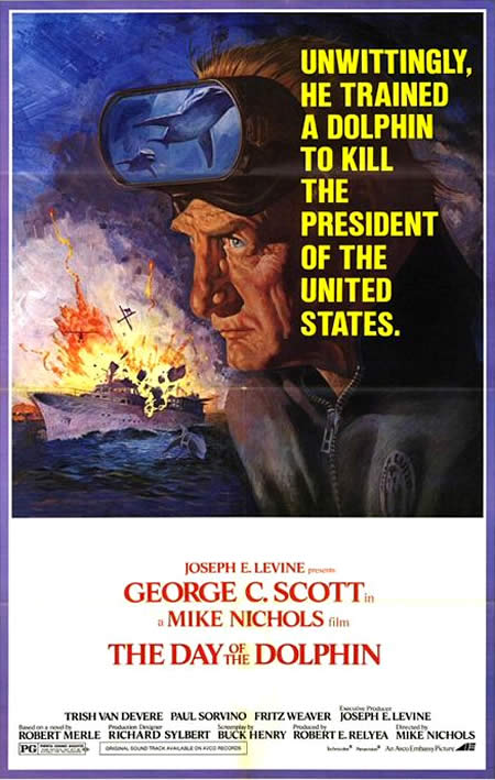 The Day of the Dolphin (1973) – This is another example in which the artwork itself is fine, but there are some strange elements that don’t make sense. The picture is based on the thrilling Alistair Maclean novel, but it’s hardly a dynamic design. Instead, it ends up being hilarious. It features George C. Scott presumably floating over the ocean with a pensive look on his face while what appear to be flying dolphins are reflected in his sea goggles. Added together, all of the elements comes across as more than a little weird.
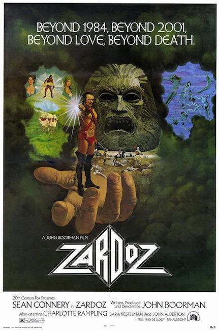 Zardoz (1974) – Poster-makers Mondo recently released a newly created poster for this eccentric sci-fi oddity – their updated version is far more effective than the original artwork. Despite all of the events depicted here, you probably still can’t get much of an idea of what this movie is about or why it’s set in a universe with giant concrete head statues and humongous hands. Admittedly, the project was already a tough sell, but if anyone wasn’t already confused enough, Connery’s costume would surely drive them far, far away from the theater.
 The Spy Who Loved Me (Ghana Poster) (1977) – Err, excuse me, I mean The Spy Who Love Me. Made for cinemas in Ghana, local talent was employed to create movie posters. The idea is great (and during this era, was also applied in Eastern European countries like Poland), but often the artisans had little to no idea of what the films were about. Since James Bond was a known property, this one has some of the elements – a tuxedoed spy and what seems to be a (somewhat horrified) woman sitting next to him. But it’s obvious that they had to churn it out a little too quickly. It’s almost like they just gave up on detailing the car. And what’s the deal with that enormous pink fish?
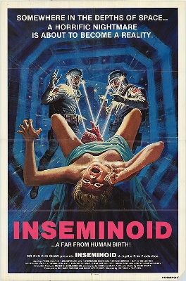 Inseminoid (1981) – I’m a big fan of horror movies, but why would I ever want to watch a movie based on that image? Of course, it’s already in incredibly poor taste, but there are other concerns. Is the woman floating in zero gravity? Are those lights or laser beams coming out of the space-helmets and into her crotch? Perhaps it’s better if we never find out.
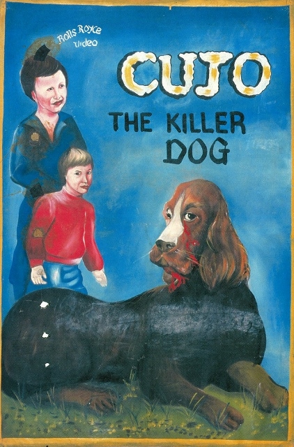 Cujo (Ghana Poster) (1983) – Here’s another specialty from Ghana and truth be told, I kind of love it. This artwork re-envisions the Stephen King story with a rabid, murderous Cocker Spaniel (or maybe it’s a Bassett Hound) in the title role. As odd as that dog appearance is, I am even more disturbed by the kid’s parent in the background. It’s completely surreal. Much like the art for The Spy Who Loved Me, the discovery of these odd works from across continents has resulted in a collector’s market.
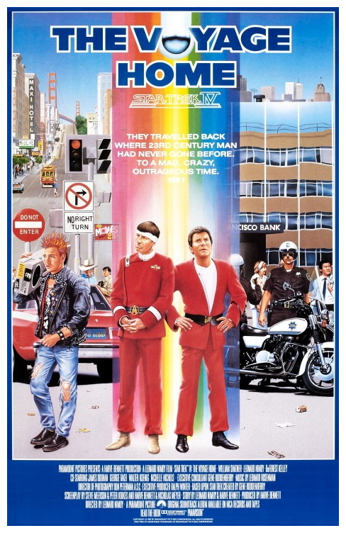 Star Trek IV: The Voyage Home (European Poster) (1986) – I like the movie, but this image is way, way too busy for its own good. I understand why the punk is pictured (he’s featured in a significant scene), but why exactly is a police officer standing there? I can’t remember a cop playing a big role in the story. Perhaps the weakest element is the bright color bar down the middle. It renders most of the text, including the Star Trek title, completely unreadable.
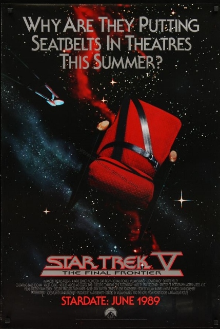 Star Trek V: The Final Frontier (Advance Poster) (1989) – Man, this franchise has had some issues with poster artwork. So, you’re attempting to depict an epic space tale with iconic characters on a grand search to the outer reaches of the galaxy. Sounds like there are a lot of creative ways you could go with the artwork. And yet, the studio decided to sell it… not with spaceships or the familiar cast members… but instead with a chair and seatbelt floating in space? Bad idea.
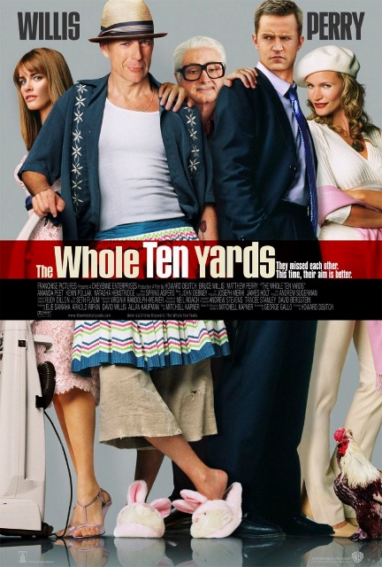 The Whole Ten Yards (2004) – In the early days of photoshop, this travesty earned a lot of deservedly negative press. Faces appear to be drawn onto human bodies, with Willis, Perry (and especially) Pollack standing out in a not-so-good way. That oversized hat on Willis’ head doesn’t help matters. And who’s hands are those on each shoulder of the two leads? The limbs look like they’re from two completely different people. Overall, it’s a horrifically strange image.
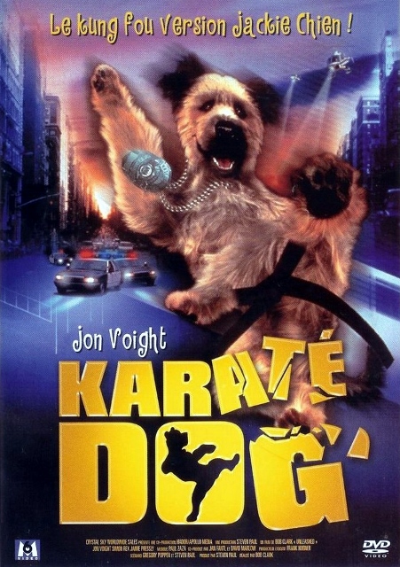 Karate Dog (2005) – Obviously, this is a French DVD release poster and not a theater poster. However, it’s so awful that I just had to include it. It’s blurry as heck, but the most perplexing element is the title character. I suppose he has the right number of legs and paws, but it all seems like those limbs are all in the wrong places. In particular, the pooch’s rear appears to be in a very unnatural position – in fact, it almost looks as if his bottom (hidden away by a seat belt?) is coming out of his chest.
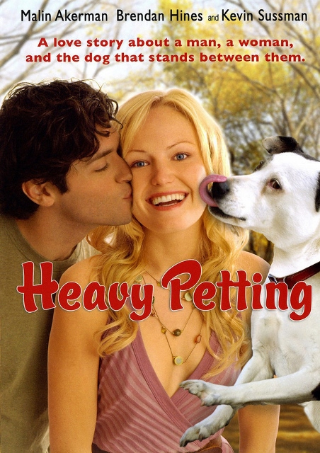 Heavy Petting (2007) – Woah, more animals! Three figures that were clearly photographed in separate locations have been less-than-seamlessly integrated in this awful poster. I’m particularly amused by the strange positioning of the dog. Is it flying or simply levitating? Sadly, the movie probably won’t provide any answers to these questions. Eerily enough, this film has a few plot similarities to Wild and Wonderful – maybe it’s the subject matter itself that leads to ugly posters.
 Good Luck Chuck (2007) – Another abominable photoshop job was employed for this romantic comedy one-sheet. The image places its stars in not only a very creepy position, but also a completely unnatural one. It looks like the heads of the performers have been added later and have a spacey look about them, adding to the generally disturbing appearance of the poster.
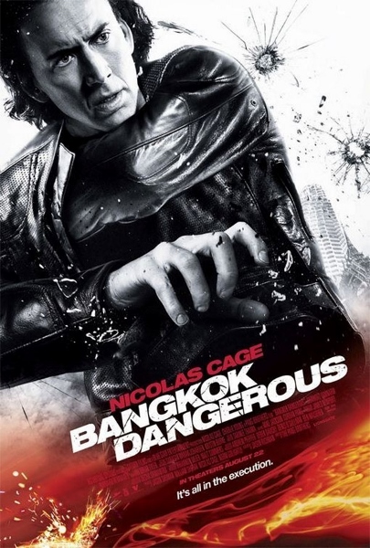 Bangkok Dangerous (2008) – So, it’s “all in the execution,” is it? This is also a notorious one that you’ve probably seen around. All I can tell is that someone’s having a really difficult time moving around in their leather jacket. It features Nicolas Cage’s head on a bizarrely positioned body. Reportedly, the studio were concerned about a gun in the actor’s hand and had it removed, leaving the actor’s fingers clutching, well, nothing. Where his other arm and hand is going is anyone’s guess. All in all, the results are unintentionally hilarious.
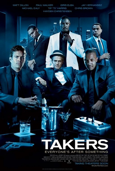 Takers (2010) – This effort garnered more press for its terrible poster than it did for the movie itself. Again, the various actor’s heads have been positioned onto completely different bodies for this image. Unfortunately, they really don’t match up at all. It literally looks like someone took out an old photo album, cut the heads of the performers off of some pictures and simply pasted them into place. The front row features the worst examples of the technique.
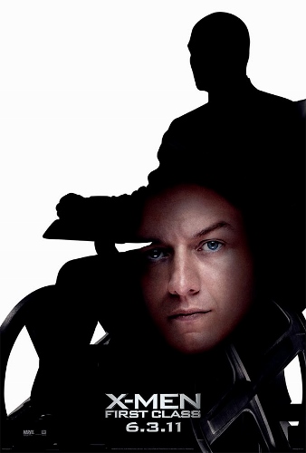 X-Men: First Class (2011) – Sometimes good movies get bad posters. The teaser image for this comic book adaptation sought to introduce and tie together actor James McAvoy with the famous character of Professor X (silhouetted here and previously played by Patrick Stewart). But the positioning of elements couldn’t be more off. Actually, it’s kind of uproarious. Who exactly would okay the actor’s head coming out of his character’s crotch?
 Chef (2014) – 2014 also seemed to be a banner year for bad movie posters. Not sure if this particular item was made for Mexico, Spain or both markets, but boy is it disturbing. The bobble-head approach to the stars isn’t appealing in the least. The cut and paste jobs on the heads are poorly done and don’t seem properly proportioned with their body parts. I’ve never seen so many strange and ill-sized hands on a movie poster. The end result is utterly confounding.
 Hit By Lightning (2014) – This photoshop nightmare is hilarious for several reasons. Obviously, different stills of the actors taken at different times in completely different locations with varied and inappropriate expressions have been awkwardly recomposed into a bed setting. Even more ridiculous is that the poster artist or artists couldn’t be bothered to remove the clothing from some of the cast members. And what exactly is the gun there for?
 Innocence (2014) – Another teen fantasy/romance gets a horrific poster that looks as if it were thrown together in about fifteen minutes. The poses are hysterical, as are the spaced out and confused expressions on the cast members. One looks like they’re headed out to the prom, while the other appears to be going jogging. Even worse, they’re both looking off in completely different directions. You know things are bad when your main marketing image makes the Twilight series look great by comparison.
Sorry for giving you all nightmares. Any others out there that you think are bizarre or hilariously ineffective?